22

My name is Lucian and, together with the Stack Exchange team, I will be in charge of creating the new design for the Personal Finance & Money site, as it graduates from the beta phase. While the site will have its own theme to reflect its topic and culture, it will still share certain common elements with the rest of its Stack Exchange family.

The main idea behind the new design is to provide an accurate representation of the topic, infused with the character of the community as it exists under the Stack Exchange umbrella. The overall theme is that of an official financial document by borrowing visual elements common to banknotes, bonds, legal stationery, and other similar materials. Additional financial metaphors spread throughout serve as quick reminders and help achieve a cohesive and distinct look.

Logo

The logo uses one of the ubiquitous symbols when it comes to personal finance – the piggy bank. Its connotations are immediate but they’re not as rigid or corporate as other common financial symbols. It has a friendlier, more accessible side that speaks to the community aspect powering the site.

On its own, a piggy bank symbol may not provide enough differentiation but the idea was to make it Stack Exchange’s piggy bank. This is achieved by incorporating visual cues to the main Stack Exchange symbol – the three horizontal lines and angled ears. Adding additional style elements reinforce its uniqueness and the end result relates both to the subject and the community’s presence and role within its larger family.

The type treatment maintains the theme by suggesting the combination of a signature with a heavy, banknote-like visual making use of siderography (the steel engraving process used for currency and old fashioned stocks) effect.
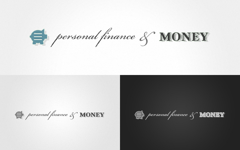
Personal Finance & Money logo

Taken separately or as a whole, the symbol and type work to establish the overall brand of the Personal Finance & Money site. They can also work as outside community ambassadors, with various degrees of supporting elements.
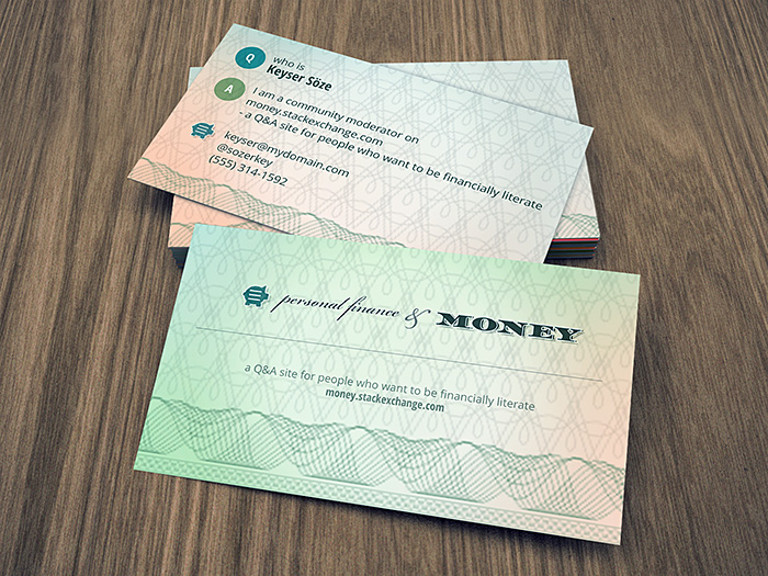
Money business card

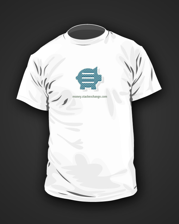
Money t-shirt

Site Design

(please click on the images below to view in full resolution)

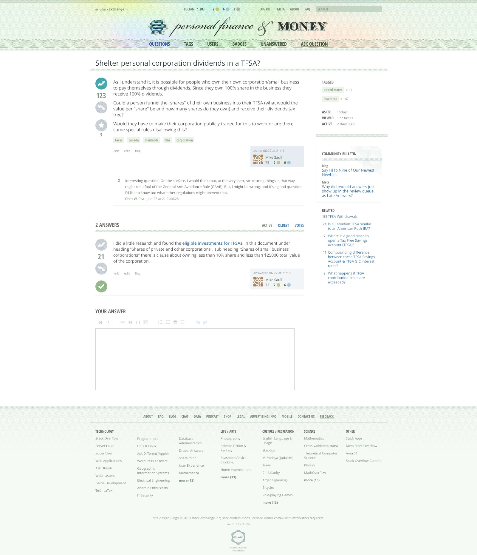
The visuals here continue the overall theme by using cues from official monetary documents.

Money.se home page

Money.se question page

Commonly used on banknotes, Guilloche patterns make up the primary background visuals for the site’s header and various other areas. They are complemented by various other graphic treatments that include financial references, such as solid full color blocks, clear dividers, and trend lines.

Because such elements can easily become overpowering through their complexity, I have tried to minimize their usage and employ them in more subtle ways throughout.

The typography maintains the theme of an official document by setting some elements in a bold, condensed, gothic inspired typeface that creates a classic, business-like feel. Again, the effect is used in moderation so it doesn’t overwhelm and does not affect legibility.

Finally, for the color palette, while keeping with the official look and feel, I’ve tried to make it as generic as possible so it doesn’t necessarily reflect one particular currency or geographic area. The global was to match and reinforce the global reach of the community.

The mockups above do not contain all the site elements, but they should give you a good idea of the overall look and feel of the design. I would love to hear your feedback. If there are no major design changes, we would like to launch the site very soon.


Update:

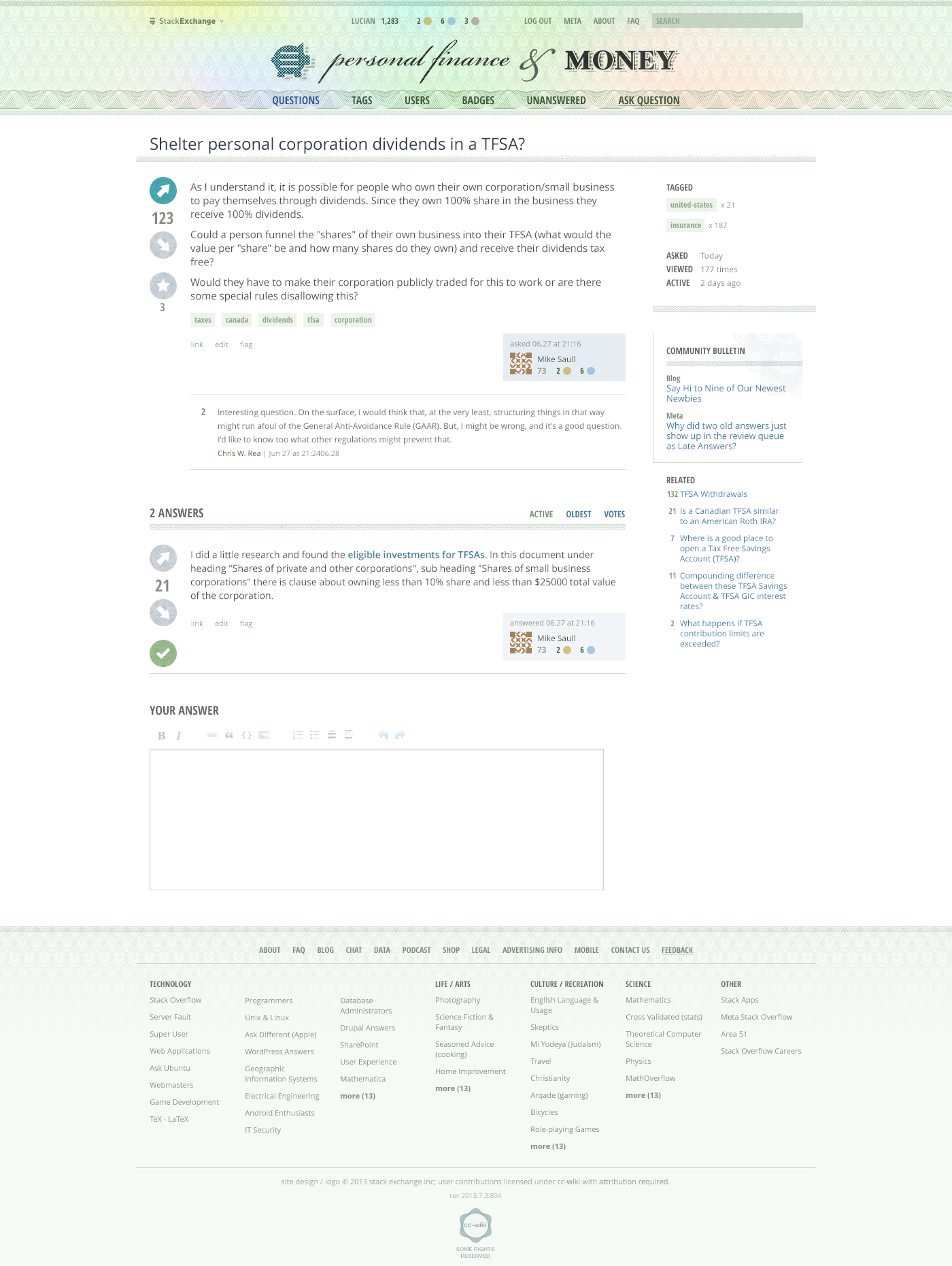
Based on your feedback, I have updated the design of the up/down arrows and included a new mockup below. If there are no other major issues, we can move forward with making this design a reality. Thank you again for your help!

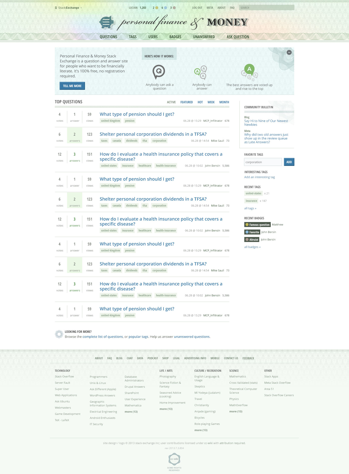
updated Money.se question page

10
  • 4
    Hi Lucian! Thanks! Looks promising. We've been waiting for a design (and launch) for a long time so hopefully you'll get some helpful feedback from the community :-)
    – Chris W. Rea Mod
    Commented Jul 24, 2013 at 16:39
  • 4
    Thanks Lucian for the design. It was a wonderful experience working with you. I think the design definitely captures the right feel, and gives our money.se community a unique branding.
    – Jin
    Commented Jul 24, 2013 at 16:45
  • If anyone's interested, chat about it in Show Me the Money!.
    – C. Ross Mod
    Commented Jul 24, 2013 at 19:30
  • 1
    Great to see a "real" design. :)
    – Alex B Mod
    Commented Jul 26, 2013 at 4:13
  • Re: your update. No other changes?
    – Chris W. Rea Mod
    Commented Jul 29, 2013 at 17:57
  • @ChrisW.Rea I'll be making some of the other changes when I convert the design to CSS.
    – Jin
    Commented Jul 31, 2013 at 3:40
  • Any updates on launch date?
    – C. Ross Mod
    Commented Aug 19, 2013 at 18:27
  • 2
    @Jin Are we next? Any ETA? Thanks!
    – Chris W. Rea Mod
    Commented Sep 21, 2013 at 13:31
  • 2
    We're next! And soon! See chat.stackexchange.com/transcript/message/11562316#11562316 Commented Oct 7, 2013 at 20:30
  • @ChrisW.Rea Did the "soon" and "next" in your comment above arrive in the new year :)
    – Dheer
    Commented Jan 10, 2014 at 8:38

6 Answers 6

13

It's a great design! Thank you, Lucian!

I have some subjective feedback. While I do have a handful of tweaks to suggest, each is minor.

  1. In the header, I like the different font treatment for "personal finance" vs. "money". Yet, we tend to emphasize personal finance questions over questions related simply to money. Could "personal finance" be made more prominent relative to "money"? Perhaps just shrink "money" a bit? (And, FWIW, the ampersand seems a bit too big for the job it is doing.)

  2. I really like the piggy bank. I'm sure most cultures have a concept for a box to save money in, and the piggy bank is a great example known by many. I appreciate that the piggy bank places an emphasis on saving. As for the bars inside: they seem spaced a little too far apart to be seen as a "stack", and too close to the pig's edges. How about tightening them up, a bit closer together? e.g.:

    Original:   Originally proposed piggy bank icon        Tweaked:   Piggy bank icon with tighter-packed stack

    (though, without messing up the dithered pixels like I did with my quick & dirty edit.)

  3. I suggest making the "Ask Question" link more prominent. I see the underline on close inspection, but even so, the link doesn't stand out as much as it ought to, perhaps owing to the all-caps used for all the links on that line. Maybe lighten the other links, or darken this one? Or something else to help it stand out more. It stands out well enough in the beta theme we have now because the font weight is obviously heavier.

  4. I agree with @MrChrister and @C.Ross that the voting buttons tend not to afford voting. Perhaps make the up & down chart arrow directions more prominently vertical? Or, lose the "volatility" part of the chart arrow? Alternatively, how about plus and minus glyphs similar to calculator buttons, instead of up/down arrows? Examples of each:

    More vertical:   Voting buttons with chart arrow angled more vertically    No "volatility":   Voting buttons with chart arrow having no "volatility"    Plus/minus glyphs:   Voting buttons with "plus" and "minus" calculator-style glyphs instead

  5. The colours for the gold, silver, and bronze badges look a bit too unsaturated (washed out.)
    Could they be dialed up a bit? e.g.

    Original badges (original)
    Alternate badges with more saturation (more saturation)

  6. The tag font ought to be more legible. The weight seems too heavy for a small font, and the font color doesn't appear to be distinct enough from the background color.

  7. In the question list, I noticed the date format is like "06.28 @ 15:29". Could we keep the format "jun 28 at 15:29" that we have now? Converting the month abbreviation to a number leads to confusion especially when dd <= 12. (Even Canadians and Americans can't agree on which comes first in a numeric date, the month or day.)

  8. Could user name links be kept blue, or colored a bit more prominently? With the beta theme, at a glance it's easy to look at the home page and see who has been posting lately. With the proposed design, the user names tend to blend in with the surrounding date numbers and reputation number.

Thanks again!

p.s. when can we get t-shirts? ;-)

9
  • 4
    I didn't even make the connection between the lines on the piggy bank on the Stack Exchange logo. Maybe that's just me, though. +1 too, because I agree with all of your other points as well. Commented Jul 25, 2013 at 2:49
  • Oh goodness, many times yes.
    – George Marian Mod
    Commented Jul 25, 2013 at 8:58
  • @GeorgeMarian "Many times"... thanks, but which points, specifically? :)
    – Chris W. Rea Mod
    Commented Jul 25, 2013 at 13:28
  • Wow Chris, talk about hidden talents!
    – C. Ross Mod
    Commented Jul 25, 2013 at 13:31
  • @C.Ross You should hear me at karaoke. LOL.
    – Chris W. Rea Mod
    Commented Jul 25, 2013 at 14:00
  • I would have been specific had I felt the need. :)
    – George Marian Mod
    Commented Jul 27, 2013 at 22:50
  • 1
    @JohnBensin Has anyone made the connection between the lines and the Google Chrome menu button?
    – George Marian Mod
    Commented Aug 5, 2013 at 5:43
  • 2
    @GeorgeMarian Good eye. I hadn't noticed that before. Now how do I set my Chrome menu button to be a piggy bank? Commented Aug 5, 2013 at 11:09
  • @JohnBensin That I don't know.
    – George Marian Mod
    Commented Aug 5, 2013 at 21:30
6

I like the look-and-feel and the logo. (I quite like the logo. Great job!)

However, I'm concerned about the menu buttons (in the header). The siderography can be quite distracting behind the labels. (just making the point stand-out.)

2
  • As I've detailed in my answer below, the text in general will be much crisper and better looking once the design is implemented. That will make the links stand out much better against the background.
    – Lucian S.
    Commented Jul 25, 2013 at 3:06
  • 1
    Thanks for consideration. I hope you won't be offended, but being dyslexic I will take a wait-and-see attitude.
    – George Marian Mod
    Commented Jul 27, 2013 at 22:53
5

I like it!

I offer feedback only for the sake of feedback; none of my opinions are strongly held and I wouldn't want them to detract from my very favorable impression. Great work!

  • The up / down icons don't give me enough of a sense of up and down. The angle makes it feel weird. I wonder if a new user, unfamiliar with the overall stackexchange UX, would intuitively the voting. Just a simple up/down might be an improvement, or increasing the angle of arrows.

  • Is a piggy bank international enough? We get a pretty high percentage of user from outside the U.S. and will a piggy bank grab them the same way? I don't know enough about the other cultures. (For me is a great! I know this would be a major change and it might be too late.)

  • Finally, I know nothing of scale! But the tags are more important to our site than their size relative to the rest of the question. Tagging questions with a country is very important for a good answer here and I wish they were a bit more prominent under the question.

Again, this is terrific work and I am very impressed. I don't expect anything to come from my comments.

2
  • 2
    Lucian and I agreed that the tag styling should be visible and readable, but not too overwhelming. The reason is because on the homepage and question listing pages, there are tags are all over the place. If their visual styles are prominent it'd make the page busy looking, also stealing focus from the question titles.
    – Jin
    Commented Jul 24, 2013 at 18:27
  • 2
    I think the height for the tag font is OK, but the font used for the tags seems too narrow and the font weight a bit too heavy, so the letters seem to run close together. Perhaps some adjustments could make the text more clear without requiring a larger font?
    – Chris W. Rea Mod
    Commented Jul 24, 2013 at 21:36
5

This design is great!

The one thing I see that's not intuitive is the voting button's icon. It took me a second to figure out what was going on.

5

Thank you all for your feedback. Let me start by answering Chris as his includes most of the feedback left by others (thank you for the detailed list, by the way).

  1. I've experimented with different lockups for the logo and this one made the most sense visually. It may not necessarily represent the correct hierarchy of the two elements, but that would be asking it to achieve too much.
  2. The piggy bank is used in a lot of cultures so I'm not worried about it translating internationally. The thinking behind the wider positioned bars is that they reference the original Stack Exchange symbol better and also work better in smaller representations, when tighter bars may render as just one big hole.
  3. The 'Ask a Question' underline will be a lot crisper once the design is implemented so I think it may be enough to help it stand out. Finer tweaks like this are typically better suited for the implementation phase as you get to see exactly how everything looks in the browser, and not just a mockup.
  4. It seems there's a consensus regarding the voting buttons. I like your suggestions and gravitate towards the 'no volatility' version as it still maintains the arrow convention.
  5. Again, perhaps something better suited for the implementation phase. As a general idea, I didn't want the badges to be the very first thing that you notice, which you might given they're the only bright spots of color on an otherwise mostly monochromatic header.
  6. It should be legible enough once coded. Photoshop is pretty bad at text rendering, especially in small sizes, but the text overall will be a lot crisper in the browser.
  7. Good catch. The format should and will remain the same.
  8. How important are these user names when browsing the list of questions? Should they be the second thing standing out after the question itself? In any case, the difference will be slightly more visible in the final implementation, again due to the quality of text rendering in the mockups.
2
  • 3
    For #6 I urge you to look at our American currency. I'm currently looking at a $5 bill. The large "5" on the back, which is plain -- with no sense of relief, is surrounded by a buffer of negative space. Most of the other fonts use shading for a raised/3D feel. Meanwhile, the serial number enjoys a crisp rendering, it is noticeably more difficult to read on the right, where it is printed over the seal. Despite the fact that the seal is muted and the serial number is crisp, the background is much too busy. If you need ideas for solutions, I have some in mind. Please get in contact with me.
    – George Marian Mod
    Commented Aug 3, 2013 at 18:03
  • @Lucian S. Any inputs on when the site would be taken live.
    – Dheer
    Commented Jan 27, 2014 at 3:44
3

I am a late arrival. I love the design! It is perfect for our site, with the paper currency look to it! I had two suggestions though.

First, thank you for including the piggy bank. I like the shape and dimensions of piggy. He is perfect! The lines evocative of SE are fine, although maybe a little forced, but I can live with that. My request may not be feasible for that very reason, the resemblance to the SE logo. However, I would really find a pink shade piggy bank more traditional and natural than a grainy blue green piggy. This could easily be addressed in a variety of ways.

Fine-tuned piggy

  1. Make piggy pink, and leave him where he is. His pink color would be a variation of the pink color that is the background of MONEY on the far right. There would be sufficient contrast, as the background color on the far left is currently a darker blue green.
  2. For a piggy on a pink background, flip the color band in the header, so that MONEY is on blue green instead of pink, and piggy is on pink. I'm not so certain about doing that!

Voting count typeface

Is it possible to use a heavier version of the typeface for the up and down voting buttons? The number of votes seems difficult to read to me. The type face is not one I've seen before. Perhaps it is more common on Canadian or other money, which is fine. But could you make it a little heavier, for readability?

Overall, the new design looks great, and rather elegant.

Thank you!

Praise
The voting buttons are better in the second version, by the way! The volatility arrow was a delightful thought, and I liked it so much, that you thought of that. But it was just too crowded given the size and color contrast.

You must log in to answer this question.

Not the answer you're looking for? Browse other questions tagged .